 Prepress
At Blok Printing we are continually updating to the latest cutting edge equipment to better serve our client's needs. Our state-of-the-art Heidelberg Printready PDF work-flow system and HP Designjet 5500 allows us to achieve the light-speed turn-arounds our customers require. The intelligent PDF work-flow system troubleshoots and corrects any problems we might encounter with your files and combined with our Heidelberg CTP Prosetter the fine details of your print project are well taken care of. With the latest high-tech equipment and knowledgeable staff, your digital projects are in safe hands.
Prepress Support
How to set up a print project and make a Print Ready PDF
With these instructions a few key areas of print layout will be highlighted, and print terminology will be explained.
Index
- Layout set-up
- Spot colours, bleed and trim size
- Rich blacks
- Spot varnish and flood varnish
- Images, photos, bitmap and vector
- Trapping, perforations, folds
- Fonts
- What all PDF’s need
- Creating a PDF the export way.
- Creating a PDF the print way.
Things to consider when designing your print project:
For example, you would like to create a simple eight page booklet with a finished trim size of 8.5”x11”. The project will have bleed, be printed four colour process + Pantone 357 and have a spot gloss varnish setup as Pantone 032. The two most popular page layout software applications are Adobe Indesign and Quarkxpress. For this example I am going to use Indesign CS2 and Adobe Acrobat 7 on a Mac with OSX.
First create a New Document 1. (if you do not see the bleed option click More Options here). 2. There are eight pages. 3. The Page Size (trim size) has been set to 8.5”x11”. Most printers prefer to have all their customer supplied PDF’s set to the final trim size. Also, it is ideal to have your front cover on the first page and the back cover on the last page. Page 1 (front cover), page 2, 3 etc.. back cover. 4. The Bleed margin has been set to .125 inches. This .125 inches of bleed is essential when you have any colour or image at the edge of the page size, it allows the printer to trim the page to the final page size of 8.5”x11” and have no white paper showing at the edge.

Spot colours, bleed and trim size
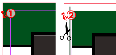
1. This is the bleed. Bleed allows the printer some wiggle room to trim your design to the final trim size. This is CORRECT, the green Pantone 357 box has .125 inches of bleed past the final trim size. 2. This is INCORRECT, there is no bleed. The green Pantone 357 box does not bleed past the final trim size (indicated by the purple lines) and leaves room for a white line (the paper) to show at the edge if trimmed slightly offline. Note: If you design your print project to have no bleed, the minimum distance from the final trim size or finished size to the text or a image should be .125 inches
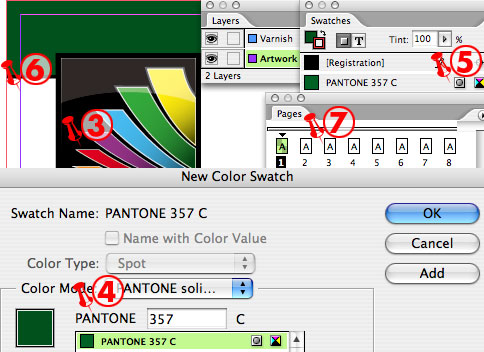
3. The Blok logo will be printed 4 colour process, which is CMYK ( cyan, magenta, yellow and black). 4. The Pantone 357 is set as a spot colour and will be on a separate plate. 5. The spot colour is indicated by this icon. Note: A true spot colour always starts with pantone. It is a common design error to create a CMYK swatch that looks green and make it a spot colour. The printer will not know what ink to use and will have to contact you and correct the digital file. Creating a varnish spot colour named “varnish” is ok. 6. This is the page size or trim size, which is where the project will be trimmed. 7. Eight pages with a trim size (page dimension) of 8.5”x11”
When creating a print project with large areas of black ink it is ideal to create a rich black or super black. This makes it easier for the printer and the final result is a darker rich black which looks better than black alone. To create a rich black is easy - create a new colour swatch and add 100% black and 40% Cyan (note: this is not to be made as a spot colour). Do not make a colour swatch with 100% black, 100% cyan, 100% magenta and 100% yellow as this creates a lot of problems for the printer and would have to be corrected by customer. Note: The rich black can only work if you are printing with a minimum of 2 colours including black.
Spot varnish and Flood varnish
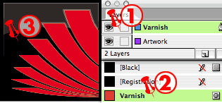
1. When creating a print project with a spot varnish (one or more areas on the page) or even a flood varnish (covering the complete page) it is ideal to create a separate layer and use 2. a pantone colour or spot colour with the name varnish designated for the varnish. The reasons for this are many, but the main reason is when using a spot varnish on a separate layer (not a separate document) you and the printer can easily make sure the varnish is in the correct position. Note: This is ideal for dielines, foils and embossing. Note: This only works when sending your packaged native files (your Indesign file with the links and fonts) to your printer. When sending a final print ready PDF you would still set up your print project like this, but send the spot varnish as a separate PDF. Note: There are two types of varnish finishes, gloss and matte. 3. Here you can see the spot varnish on a separate layer and the designated Pantone 032 (named varnish) as my varnish plate with the visibility of both layers on.
Images, photos, bitmap and vector
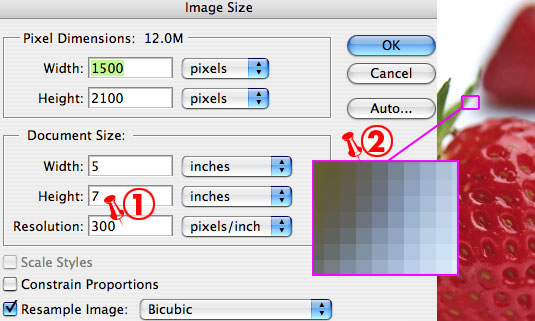
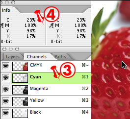
Working with images and adding them to your print project can be complex and overwhelming. There are a few key areas you should be aware of, starting with resolution. Resolution or PPI (pixels per inch or sometimes referred as DPI dots per inch) determine whether your image is hi-res or low-res (high resolution or low resolution). The image below is a 5”x7” with a 1. resolution of 300ppi opened in Adobe Photoshop. This image at 100% would be classed as hi-res. Now if you place this image in your print project in Adobe Indesign at 100% this would still be classed as a hi-res image. This is where it starts to get tricky. If you enlarge this image in your print project to 200% this image would now be classed as low-res and now have a resolution of 150ppi . 2. Here's why: the image below is a bitmap image or sometimes referred to as a raster image, and is made up of a grid of dots known as pixels. Bitmap images can lose detail when scaled on‑screen because they are resolution-dependent. They contain a fixed number of pixels, and each pixel is assigned a specific location and colour value. Bitmapped images can look jagged if printed at too low of a resolution because the size of each pixel is increased. Confused? It gets worse - the screen ruling or LPI (lines per inch) the printer uses also affects the quality of the image. A good rule of thumb is to use images which don’t need to be enlarged and are at least 300 or 400ppi. If your printer is going to use a screen ruling or LPI of 150 lpi than 300 ppi is fine. If your print project is to be printed at 200 lpi than 400 ppi is fine as it is basically a two to one ratio for large commercial printing presses. 3. The images below show the Channel and Info palettes. The Channel palette shows you the CMYK breakdown of the image and 4. the Info palette shows you the percentage or density of each colour in any given area of your image. Understanding your ink percentages is the key to professional looking print jobs. The best looking images are always high contrast images with crisp white highlights and dark shadows. If you're wondering what format the image should be saved as, a good-rule-of-thumb is to save all bitmap images as a tiff which is lossless which means image data is not removed when saved. Jpeg on the other hand is lossy, meaning the decompressed image isn’t quite the same as the one started with and every time the file is saved more and more image data is lost. Vector graphics are made up of mathematically defined lines and curves called vectors. You can move, resize, or change the colour of a line without losing the quality of the graphic. Vector graphics are resolution-independent—that is, they can be scaled to any size and printed at any resolution without losing detail or clarity. As a result, vector graphics are the best choice for representing bold graphics that must retain crisp lines when scaled to various sizes (logos, for example). Vector images are created in programs like Illustrator or Freehand.
You do not need to add any trapping if Blok Printing is to print your project. We use Heidelberg trapping software which can trap a file in seconds and is more accurate than manual trapping. It is best to add perforations to your print project on a separate layer as a spot colour named perforation. This rule applies to folds as well.
Fonts, type, bitmap, truetype, postscript, printer-fonts, OTF.....
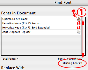
There are a lot of different font types out there and they are the number one reason for prepress headaches. When creating your print project it is ESSENTIAL the fonts used are given to your printer. The reason for this is that your Times Roman could be different to your printer's Times Roman and the result could be reflowed text. The best way to supply your printer with the fonts used in your print project is to package your project which can be done through Adobe Indesign. How do you do this? It’s easy! With your print project open check to see that all the fonts being used are available. This is in the submenu - Find Font under the Type menu. 1. Here you can see that the font Optima LT Std black is being used and is unavailable or missing. You can either find this font or change it to another font. Once the missing font has been corrected you can package your print project which is in the submenu Package, under the File menu. Quarkxpress has similar options and it is called Collect For Output. We recommend that all designers use a good font manager. A very good free font manager is Linotype FontExplorer and a very good manager to purchase is Extensis Suitcase Fusion. A good font manager does exactly that - it manages the fonts and most of them today scan your font library and weed out any corrupt fonts. If you decide to purchase a font library I would recommend the font type OTF. OpenType is the unification of the two most powerful and widely used font formats today, PostScript and TrueType, into a single font format. Developed by Adobe Systems Inc. and Microsoft Corporation, OpenType brings these two technologies together and extends them with new typographic and line layout capabilities. OpenType will be the new standard for high quality type in print and on the web.
How to make a print ready PDF
There are many ways to make a PDF. We will show you two ways to make a print ready PDF from Adobe Indesign. Adobe Acrobat will be required. First make sure all fonts used in the project are available and all the images used are linked.
What all PDF’s need:
- All fonts used are embedded.
- All raster images are a minimum of 300ppi and a maximum of 400ppi
- The print project has the correct trim size with trim, fold and perforation marks visible and if needed includes bleed.
- Colours are specified in the correct colour space (as intended to print).
The Export way.
- Step 1:
- Select Export in the submenu under the File menu and choose the format Adobe PDF.
- Step 2:
- Choose where to save the PDF.
- Step 3:
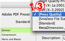
- 3. Select Press Quality as your PDF Preset.
- Step 4:
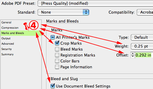
- 4. Under Marks and Bleeds select Crop Marks, and Use Document Bleed Settings (previously set as 0.125 inches, make the Weight 0.25pt and the Offset 0.292 inches.
- Step 5:
- Save these settings as your new PDF Preset: click Save Preset and choose any name that makes sense ie: Darren’s PDF Print and then choose Export. Once the PDF Preset is saved you can select it when you make your next PDF.
- Step 6:
- It is a good idea to open your PDF with Acrobat and make sure everything is ok ie: the pantone colours are there, the transparency is separating correctly, the images look fine etc. Output Preview is a great palette with Acrobat 6 and up. It is located under the Advanced menu. It shows the colour separation and ink percentages of your PDF.
The Print way.
- Step 1:
- Select Print in the submenu under the File menu.
- Step 2:
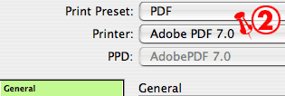
- 2. Then select “Adobe PDF 7.0” under Printer .
- Step 3:
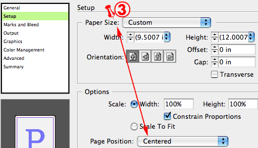
- 3. Under the Setup menu, make sure the Paper Size is set to Custom and the Page Position is Centered.
- Step 4:
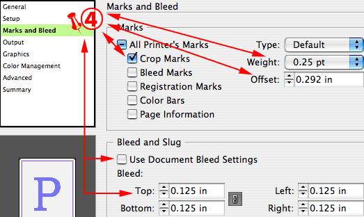
- 4. Under the Marks and Bleed menu, make sure Crop Marks is selected. Also make sure the Weight is .25pt, the Offset is 0.292 inches, the Bleed is 0.125 inches or use your Document Bleed Settings. Note: You have to manually drag or position your bleed in the Indesign file.
- Step 5:
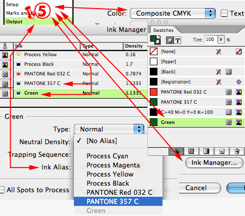
- 5. Under the Output menu, make sure the Colour is set to Composite CMYK. This is always selected even when you are using pantone colours. Under the Output menu, there is an option called Ink Manager. The example below has a Pantone 357 C and a spot green but we only want to have the Pantone 357 C printed. However there are a few items within my Indesign file using the spot green colour swatch. You can simply remap the spot green swatch by selecting it, then select Ink Alias and choose Pantone 357 C. This means every item which was using spot green will now be output to Pantone 357 C.
- Step 6:
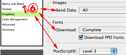
- 6. Under the Graphics menu, make sure the Images Send Data is set to all. Fonts Download is set to complete and Download PPD fonts is selected as well as Postscript® is set to Level 3.
- Step 7:
- Under the Colour Management menu, you can use what you like. However, we have found we get the best result using the Profile U.S. Web Coated (SWOP) v2.
- Step 8:
- 8. Under the Advanced menu, make sure the Transparency Flattener Preset is set to High Resolution. Note: You can now save these settings as a Preset.

That’s it, hopefully this article was helpful and a few headaches have been erased.
Cheers,
Darren E. Prepress Technician


